2022–2026 · 6 months, 2 phases
Digital Loans.
Role
Product Design Manager
Scope
Product Strategy, UX, UI, Microcopy, Usability Testing, Legal Collaboration
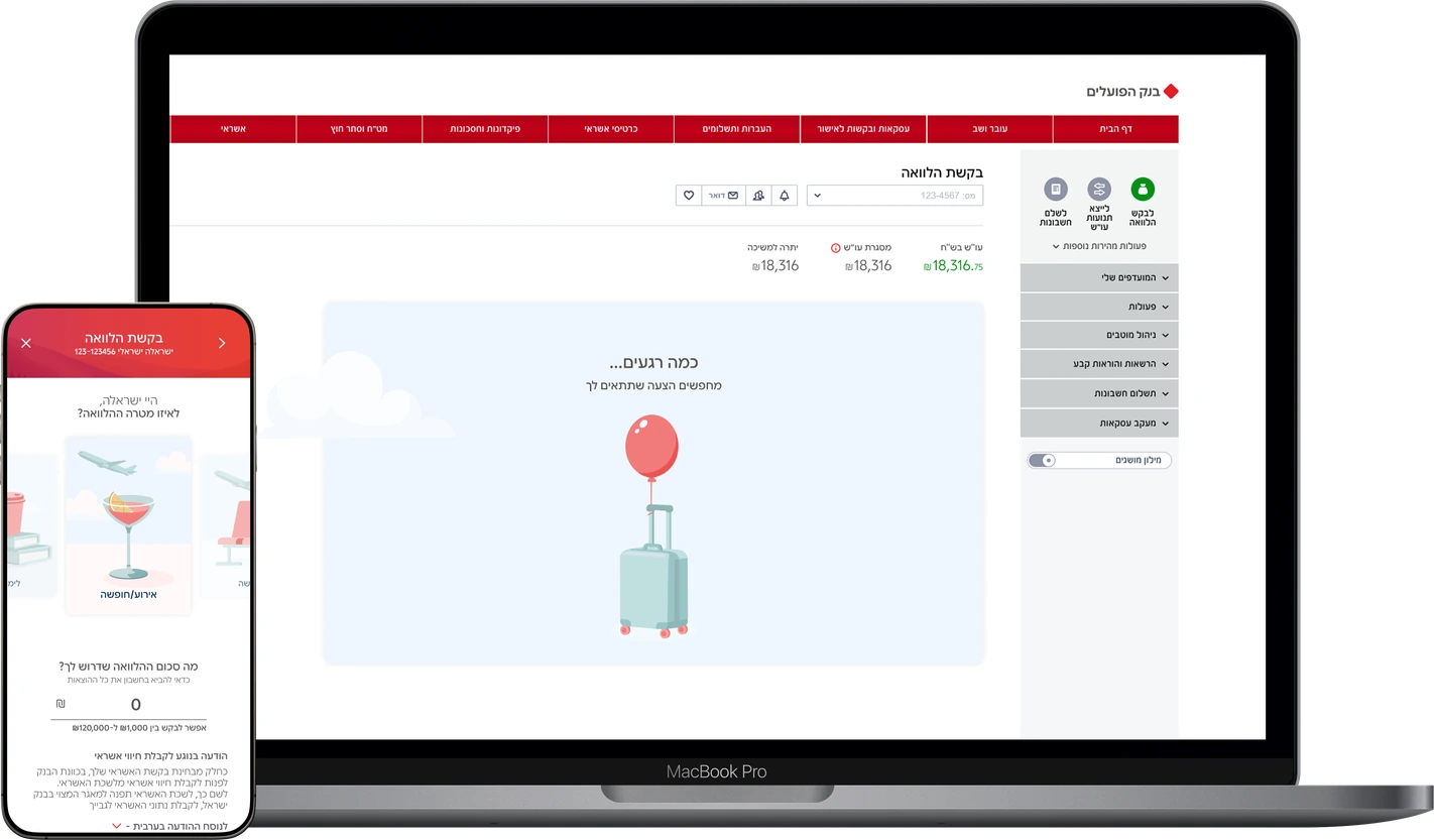
Bank Hapoalim's loan flow showed offers before checking whether anyone qualified for them. My strategy was to invert it: ask for the amount and the purpose first, check eligibility on the opening screen, and let the reason for the loan shape everything that follows.
loan
conversions
Cumulative growth in loan conversions.
self-service
migration
Loan applications moved to digital self-service.
monthly
flow entries
People entering the loan flow every month.
the challenge.
The loan request flow in Bank Hapoalim's app and website, for existing private customers. I watched what people actually did in it: they worked through the options one at a time, gave up, came back, and often could not say what they had just applied for.
A Lobby, Not a Product
A loan for one employer's staff, up to 50,000. No need to wait for payday, up to 7,000 at 500 a month. Every new loan type added another tile, around fifteen behind the screen, and nothing explained how one differed from the next.
Eligibility Came Last
Pick a tile, run a simulated calculator, keep going, and only then get asked what the loan was for and whether the bank would approve it. If the answer was no, that was the end, several screens after the hope had already been built.
A Transaction, Not a Milestone
Every screen read like a contract. The same dry, legalistic wording ran whether the money was for a vacation or for medical treatment, with nothing in it acknowledging that the person on the other side was doing something that mattered to them.
the mvp.
My first proposal was to reduce the roughly fifteen loan types themselves, bank-wide. Backend and internal constraints ruled that out, so the fix moved to the only layer I could actually change: not what the bank offered, but what it asked for, and when.
Stop People Early, Not Late
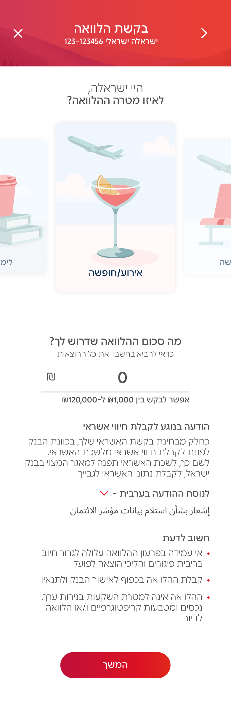
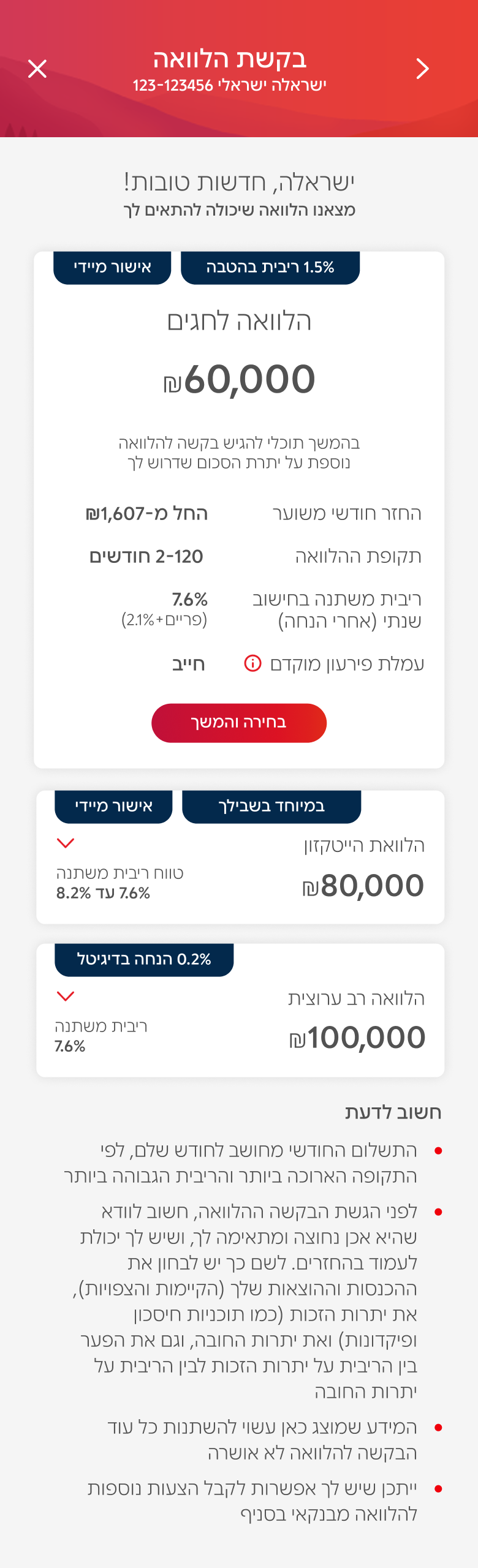
Amount and purpose moved to the opening screen, then the eligibility check, then offers. The product manager wanted that check late, so the bank could collect a lead along the way. But a lead that ends in a refusal was never a lead.
Ranked, Not Listed
Ask for 80,000 and the first offer might be 70,000, because it clears instantly and at a better rate. The full amount sits below it, approved by a banker. Rate, closeness to what was asked, and speed of approval decide the order.
Nothing Shipped Finished
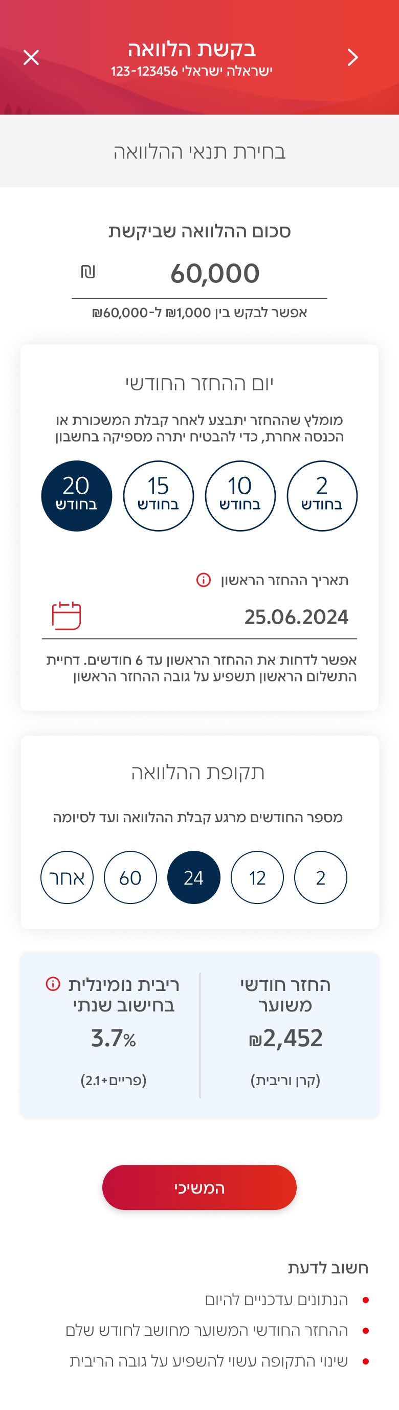
Glassbox and dashboards showed what people did rather than what they said. On desktop they clicked whole offer tiles instead of the button inside them, so the tiles went from a stack to a row, which fixed the clicks and made the offers comparable.
the strategy.
Declaring what the loan is for is not a design choice. Every credit provider in Israel has to ask it, and the answer feeds the eligibility check itself. It arrived as a compliance field, and it was the most useful thing on the screen.
One Answer, Everything Downstream
Whichever purpose someone picks on the first screen decides the illustration they see, the wording of the loader while eligibility runs, and the sentence that greets them at the end. One required field, collected once, shaping every screen after it.
Written for the Moment, Not the Product
A car loan waits behind “your car is almost here”. A vacation says “packing your offers”. Debt coverage drops the cheer entirely and says we are here to help you get back on balance. The same screen, six different rooms.
A Loan Is a Product, Not a Procedure
Vacation, Car, Medical, Studies, Debt Coverage and Shopping are six different states of mind, not six labels. Someone borrowing for treatment is not in the same place as someone booking a flight, and a bank that writes to both identically is writing to neither.
happy flow.
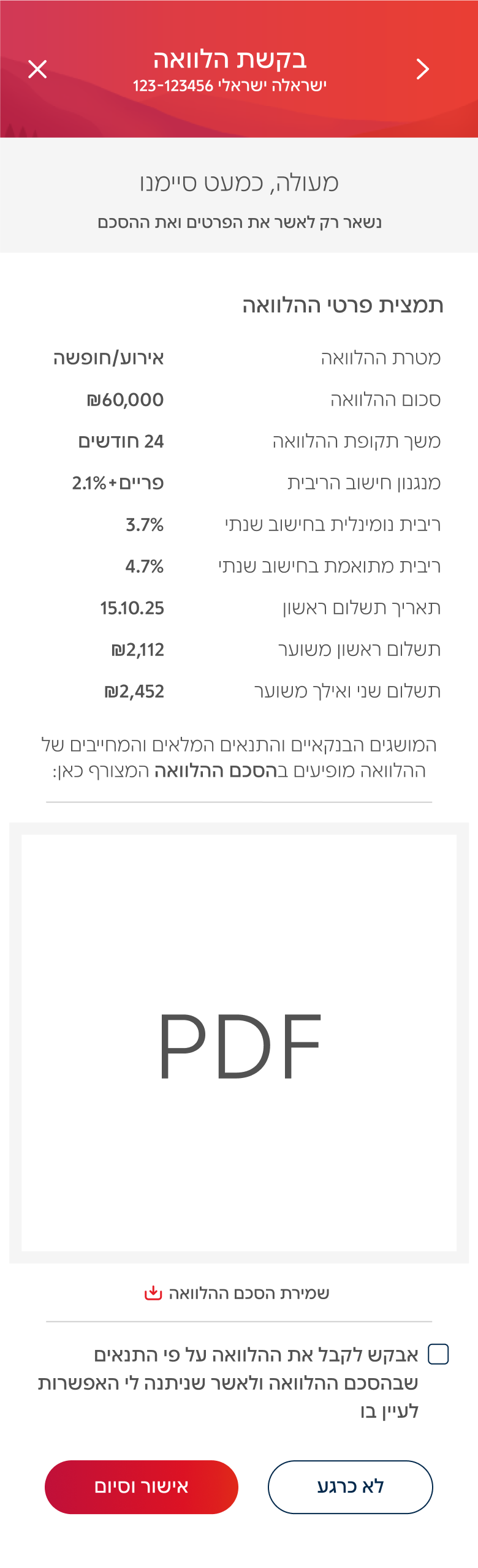
The animations below are the loader and closing moments from all six purposes at once. Pick one from the menu underneath and that purpose’s whole flow plays in order, from the opening request through the eligibility check to the screen confirming the money moved.



the proof.
The digital channel is the bank's largest branch. If it had a door, a million and a half people would walk through it every month, and roughly 180,000 of them come to ask about a loan. Getting that flow right was never a small fix.
What People Left With
The flow now answers the two questions it used to leave open: can I get this, and is it right for me. People reach the end knowing what they signed up for, which the old one could not claim even of those who finished.
The Phones Went Quieter
Hundreds of inquiries a month stopped reaching the call centre. Customers were phoning to ask whether they qualified and what the numbers meant, and both of those now arrive on screen before anyone reaches for the phone.
what I learned.
A loan is not a product anyone expects to feel like anything. But two people asking for the same amount can be in completely different places, and I came out of this convinced that where someone is when they ask is part of the product, not a layer applied on top.
I also learned something about disappointment. A refusal at the end of the flow is the bank turning you down. The same refusal on the opening screen, right after the credit registry answers, is your own credit data speaking. Same result, and a completely different thing to walk away with.