2026 · 3 months
Credit Card Ordering.
Role
Product Design Manager
Scope
Product Strategy, UX, UI, Microcopy, Usability Testing, Legal Collaboration
Some of Bank Hapoalim's cards stood for something real and the ordering flow gave no sign of it. My answer was not a new product but a flow built to carry what was already there, with the regulatory text moved off the moment of choosing.
the challenge.
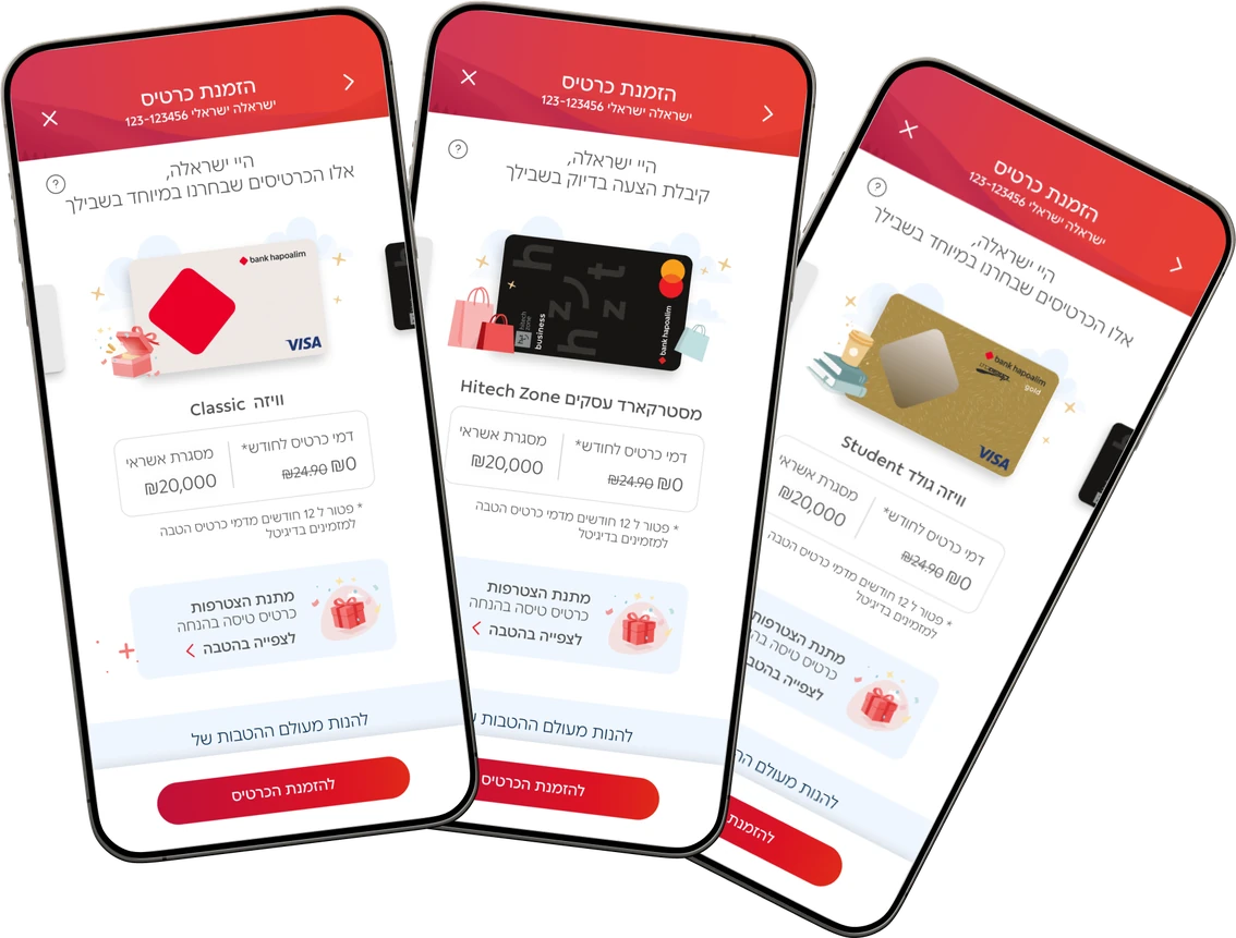
The card ordering flow in Bank Hapoalim's app and website. Leadership asked for higher conversion in it, and the first thing on the screen was a portfolio of genuinely different cards presented as one uniform list. No amount of interface work raises conversion on cards a customer cannot tell apart.
Everything Looked the Same
The flow opened on three cards with nothing saying why those three. Each carried the same dry rows of terms, no benefits, nothing written to persuade, so the only thing separating one from another was the plastic in the picture.
What Was Good Stayed Hidden
Behind those three sat many more cards, some built around a real idea, one for flying and one for working in tech. Even a plain Mastercard carried a discount day once a month. None of that reached the screen.
Regulation Took the Foreground
Between the card and the confirm button sat the credit reporting notice and a paragraph on what happens when payments are missed. The last thing a customer read before choosing a card was a warning about not paying for it.
the strategy.
Leadership wanted a ten point lift in conversion. I asked for a wider range first, since the cards that stood for something were the ones eligible customers rarely saw. Plastics could not be reduced, new cards could not be added, cashback was off the table. So my strategy took the one thing still in reach: the experience.
Give Each Card Its Own Place
A store does not wrap every product the same way. The flow had been treating a whole catalog as one kind of object, so the fix was to stop looking for uniformity and give each card the framing its own idea already deserved.
Sell the Card, Not the Terms
Competitors were offering clubs, cashback and discounts, and none of that was on the table here. What was on the table was writing to the person choosing: what the card is for, who it fits, what it gives back, above the row of numbers.
Compliance After the Choice
The credit reporting notice is a legal requirement, not a placement instruction. Moved out of the space between the card and the confirm button, into disclosure a customer opens, it keeps the obligation intact and stops being the last thing read before deciding.
the evidence.
The work is still in development, so nothing here is a shipped result. High fidelity prototypes went through several rounds of usability testing with real customers, and the questions they answered were whether a card can carry an idea inside a bank's constraints, and whether moving the warning changes what a person does.
People Could Tell Them Apart
In testing the choice stopped being a guess. Given cards that each said what they were for, participants moved through the selection without stalling on it, which is the behavior the old flow could not produce no matter how short it got.
It Read as a Product, Not a Form
Wrapping a card in the world it belongs to changed what participants thought they were looking at. The same terms, the same limits, the same fee, and the screen stopped reading as paperwork to complete and started reading as something to choose.
Nothing Was Removed
Progressive disclosure is often heard as hiding something, which is the objection worth answering. The notice and the missed payment consequences stayed in full, one tap from the card, and the move cost the flow none of the compliance it started with.
what I learned.
Design cannot make a product different. It can only make a difference legible. That sounds like the smaller job, and then you meet a case where the distinctions were real all along and no screen had ever carried them. Most of the work here was not invention, it was retrieval.
The other lesson was about refusing a number. Turning down the ten point lift was not turning down the work, it was the only useful thing left once the product itself could not move. Naming what design cannot reach is what made room for what it could.